Embrace your inner minimalist when prepping your home for sale. Here’s a room-by-room guide:
Declutter. Edit your space. Get organized. You’ve probably heard all sorts of classic advice like this for getting your home sale-ready. But it’s helpful to know the goal behind these tips.
By paring down and minimizing distracting elements in your home, you give potential buyers the ability to imagine themselves living inside it. A clutter-free environment allows the space, beauty and intrinsic value of your home to shine. Beautiful wood floor details might be concealed with too much furniture, or pleasant natural light might be obscured by heavy drapery. So edit your home by replacing and eliminating unnecessary, distracting and cumbersome items. Below, we break down this less-is-more approach for each room.
When It Comes to Living Rooms
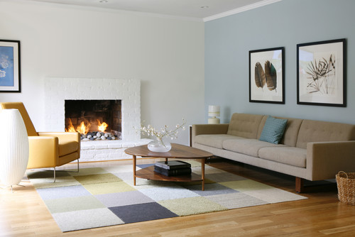
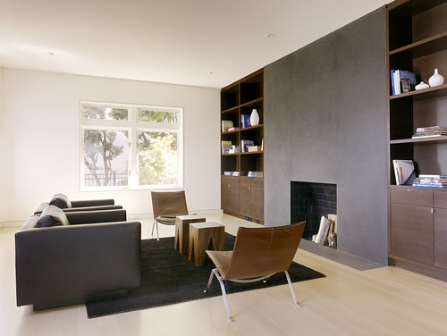
Keep only essential furniture. The living room is often the most used room of the house, and it may collect extra furniture that isn’t typically categorized as living room furniture. The key to staging this space is to stick to just the essential pieces: typically a sofa, coffee table, rug, accent chair and media console.
That corner desk with a computer on it may be essential for the way you live – but it’s not great for the room. While your home is on the market, perhaps find an alternate workspace or use a laptop. Similarly, if you need that end table to hold a much-needed table lamp, then leave it. But if you have two end tables, perhaps you don’t need both. Having fewer pieces will help the space feel larger.
Use only proportional pieces. Once you’ve edited, ask yourself if the living room feels spacious or cramped. If the living room still feels crowded, consider the size of your furniture. Are any pieces overwhelming for the size of the room? If so, try replacing that oversized piece with something smaller and compact. You might find substitute pieces in other rooms. Or, if the problem is a large sectional sofa, perhaps remove a section. Don’t worry about reducing seating. The goal is for the room to read larger so that it appears as a desirable living space.
Place furniture strategically. Next, bring your editing eye to the furniture placement. Are pieces placed in a way that makes the room spacious and bright? For example, if an item is sitting in front of a window, you’re likely blocking light. Rearrange to showcase the room’s best natural light. Play with the placement, angling pieces, using corners of the room to open up the space.
Pare down accessories. Next move on to your decorative accessories, including wall art. Do these items detract from the positive features of the room? Try removing all accessories and wall art, then adding back one piece at a time. Stop when the room looks simple, with just a touch of personality. Throw pillows are a good example: While four coordinating ones may make a lovely design statement, using just one or two allows visitors to pull back the focus to the entire room.
You also may want to edit your bookcases, displaying select books with a mixture of neutral accessories. You’ll want to remove most framed photos, though it’s OK to keep one or two images that are more vintage, such as snapshots of grandparents or an old baby photo. This gives a little life and personality to the room without showcasing your entire family album – a definite “no” in home staging.
Time to Tidy the Kitchen
Keep surfaces clear. Think about those fabulous kitchen showrooms: gleaming counters and stove-tops, organized refrigerators. That’s how you want to present your kitchen. Make sure the surfaces are as clear as possible and that every nook and cranny is clean. Keep smaller accessories such as coffee makers to a minimum, and make sure they, too, are spotless.
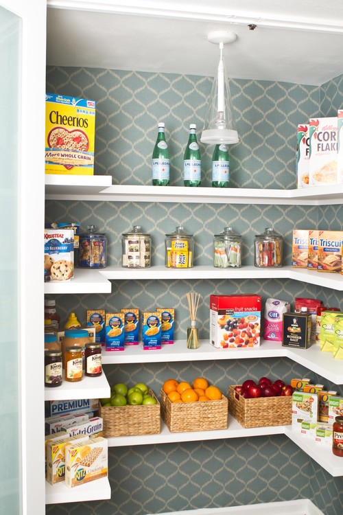
Organize your cabinets and pantry. People considering purchasing your home will likely look behind closed doors, so give your kitchen cabinets and pantry a good edit. Organize, discard or give away anything messy or that hasn’t been used in a while. Make everything in your pantry look more appealing by storing items in inexpensive Mason jars or canisters.
Next, pare down and organize the contents of your refrigerator. Buyers will be paying a lot for your appliances, so make them look appealing. As with the pantry, you might try placing smaller foods such as vegetables in plastic bins. This will not only organize your fridge, but be visually appealing.
Spiff Up the Bedrooms
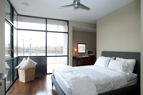
Remove excess furniture. Furniture in the bedroom adheres to the same principles as the living room. Do you have extra furniture in the room that suits your storage needs but makes the room feel smaller? Keep in mind that what’s practical to you might scream “No space!” to someone else. See if you can eliminate any extraneous furniture and storage pieces, finding alternative storage solutions for the items they contain. One option is to use large plastic storage bags under the bed for off-season items. If under the bed isn’t possible, perhaps a concealed space such as a closet or the garage will do the trick.
Replace oversized beds. Another important guideline is to look at the size of the bed in the room. Specifically, is the bed too large for the space? A common staging faux pas is leaving a king-size bed in a small bedroom. This makes the room feel small, when it might in fact look spacious with a queen-size bed. Another mistake is to leave a queen or full-size bed in a minuscule guest room that’s better suited for a pullout sofa.
Edit your accessories. Similar to elsewhere in the house, keep the accessories and knickknacks in bedrooms to a minimum. Try storing everyday sundries in decorative boxes placed on a dresser. To open up the space with wall art, use only minimal coordinating pieces or a mirror.
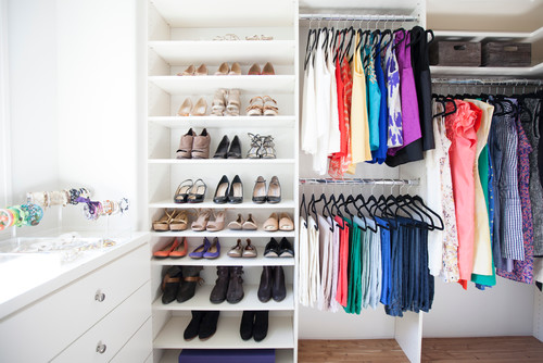
Show your closet some love. As a final step in the bedrooms, spend some time making closets look, at the very least, neat. Jumbled messes won’t make potential buyers want to move in. Quite the opposite. They may feel the mess shows that there isn’t enough room in your home to live well. Take the time to edit your closet and be realistic about keeping each and every item. You’ll be surprised how much you’ll get rid of.
Don’t forget the kids’ rooms. While kids may have many more smaller items like toys, books and school gear, editing their toy chest, closets and shelves ahead of time will prove helpful for your move. Similarly, organizing the items in their rooms in visually appealing containers will present a happy environment to a prospective buyer.
The Final Step: Styling the Bathrooms
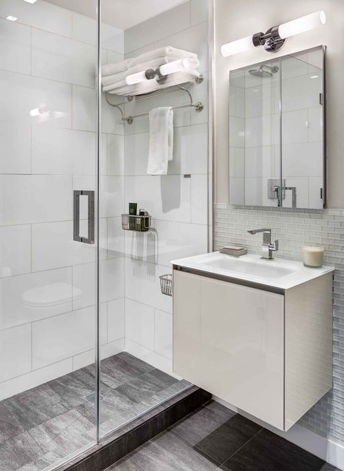
Less is definitely more when it comes to staging a bathroom. Buyers don’t want to see anything personal. Surfaces should be clear of toiletries. Showers should only show the bare minimum. Opt for a pretty liquid soap dispenser in the shower while you sell your home. Remove any extraneous artwork or knickknacks on shelves. In fact, pare down the bathroom to its bare minimum fixtures and hardware, and, most importantly, clean it until it’s gleaming.
Tell us: What have you done to present a home successfully to potential buyers? Share your experiences and advice in the Comments.
Also See:
- The Benefits of Hiring a Home Stager
- Connect With a Local Home Staging Professional
- Be Inspired by Thousands of Beautifully Organized Closets
Houzz is the leading platform for home remodeling and design, providing people with everything they need to improve their homes from start to finish – online or from a mobile device. www.RealtyTimes.com Copyright © 2016 Realty Times All Rights Reserved.

